Dear David:
I know you really care about floors. I know because I've been to your Neues Museum in Berlin and your Saint Louis Art Museum extension, and both have exceptional floors.
And I know you were unhappy with the floors at your new Museum in Milan, the Museo delle Culture (Mudec). So unhappy that, after working behind the scenes to get the floors fixed, unsuccessfully, you chose to go public: first disowning the building, then releasing a letter in which you complained about some 60,000 square feet of sub-standard lavastone. In the letter, you said that the hundreds of slabs of volcanic rock displayed "a substantial lack of homogeneity"; that individual pieces had gaps, chips and cracks; and that the installation introduced bad joints and other defects.
But could the floors really be that bad? I was curious, so I made my way to the museum. And here's what I think:
The floors are horrible, They are streaky and uneven and unworthy of a David Chipperfield building.
But you should embrace the building anyway. Because it's wonderful. So wonderful that no one will be looking down.
You were given a courtyard to work with -- a courtyard in the formerly industrial Zona Tortona. A quadrangle of four-story buildings wraps around your site, hiding your building from the street.
What you created in that courtyard looks entirely utilitarian. Walking the perimeter of your museum, I saw nothing but galvanized metal and glass. The only "decoration" is the museum's logo, made of thin, white neon tubes that are practically invisible unless you're looking for them. Your restraint is impressive.
The most amazing thing you did was make the roof appear to meet the walls without any kind or overhang or parapet. It's an entirely flat, entirely uniform surface -- a gift to the people who live or work in the surrounding buildings. Your strategy was to cover what's on the actual roof with metal grates. The grates have enough depth that, unless you're looking straight down from a helicopter, all you see if a continuous gray surface. A spectacular detail.
In fact, it must be infuriating that the roof, which few people will see, is more perfect than the floor, which lots of people will be walking on.
But don't worry, because you've created an interior that draws eyes upward. At street level, the museum is strictly functional --a large lobby opens onto a bookstore, a cafe, a children's learning area, coat room and rest rooms. Everything is super-spare -- except for the coffered concrete ceiling, which is beautiful and had me looking up.
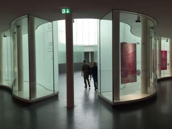
But the piece de resistance is the stairway. It's an elegant single flight that leads straight up to an amoeba-shaped lightwell.
The lightwell, or the agora, as you call it, recalls other googly rooms, like the Hall of Science, by Wallace K Harrison, in Flushing Meadows Park. Harrison used concrete studded with dark blue glass. You've used light green glass set into aluminum mullions, creating a form that's a perfect balance of a doodle and a grid.
Pinwheeling around the atrium are windowless galleries. The two current shows are beautifully installed. The curators know what they're doing, and that's to draw visitors' attention to the objects on display.
I'm not saying floors aren't important. I once had a contractor rip up a just-installed kitchen floor and start over because the tiles weren't lined up properly. So I feel your pain.
And that was just my kitchen. Yours is a very public, $70 million, 180,000-square-foot building. But Zona Tortona is all about imperfection -- the buildings surrounding your museum are covered in graffiti. This is a gritty urban neighborhood, not the Acropolis.
And you've succeeded in creating a fabulous museum in this tricky location. Your building has so much going for it that even bad floors can't spoil it. You should put your name back on it.
Sincerely,
Fred Bernstein


