Dearest Martha,
WHAT A WEEK! I was sorry to see the “buzz” about your food pics. For what it’s worth, my colleagues think your photos are post-modern masterpieces. And I concur.
The visual metaphors in your photographs are brilliant! The bold direct lighting representing the harsh spotlight of fame. The distorted colors representing the half-truths of public perception. The shadowy darkness where the true self hides. The soft, sloppy focus echoing the uncertainty of the human condition. It all blends together in a stark visual commentary on the dualistic nature of celebrity, presented as an unappetizing plate of food. Fame, like these contorted vittles, is hard to swallow.
You put the “art” in Martha, Martha. There is genius in your work.
But the internet is a cruel place. When it doesn’t understand complex artistic vision, it must lash out. It must debase it. You know who else was mocked, shunned, and misunderstood? Pablo Picasso. Maya Angelou. Mark Twain. They whitewashed the walls of 5Pointz this week, Martha. Raw creativity is under attack.
The last thing I want to do is get between you and your art. But I think you should lay low for a while. Dial it back a bit. Start taking “normal” photos of your meals. Give the people what they think they want, which will only make them miss the avant-garde tableaux it replaced.
Before and After: BurgerClick to Open Overlay Gallery
Martha style (left): Similar to Lars von Trier’s Dogme 95 movement, shooters must adhere to certain rules (top-down composition, flash on). Normal style (right): Side-angle compositions may be utilized. Image: Liz Stinson/WIRED
In short, that means you’ll need to take less-experimental photos. This probably sounds impossible to a visionary like yourself. But there’s a method to the mediocrity, and with a few basic adjustments to your style, you can mimic the “acceptable food photos” everyone is clamoring for.
The first part is the hardest. You’re going to need to turn off the flash. I know, I know… asking Martha Stewart to take food pictures without a flash is like asking Hitchcock to stop making cameos in his own films, or asking Michael Jordan to keep his tongue in his mouth while playing basketball. It’s your signature, your stamp. But it’s essential if you want to make your pictures look “normal.”
If you must, you can wean yourself off the flash by diffusing it with the corner of your napkin. Or you could just turn it off completely, ask your dinner mate to put their phone in flashlight mode, and have them illuminate the dish from another angle. Your friend can adjust the intensity of the light by moving it around. You see, the thing that gives your photos their distinctive look is the fact that you’re pointing the flash at your meal, head-on, from inches away. With a constant source of light, your camera will expose your shot differently — properly, according to the lemmings. And because your flash won’t fire as you hit the shutter, you’ll be able to see how the photo will look while you’re composing it.
Before and After: BeverageClick to Open Overlay Gallery
Martha style (left): Bathed in the glow of the flash and artificial light, the entire beverage must be included in the shot. Normal style (right): Smaller components of the beverage and natural light may be featured. Image: Joe Brown/WIRED
Once you’re comfortable shooting flash-free, you may want to request a table by the window. Perhaps even consider dining al fresco. I understand the dilemma: You’re Martha Stewart, and you just want to enjoy/photograph your meal without being hounded and interrupted by fans. But dining outdoors or sitting near the window will throw plenty of diffuse sunlight onto your repast. And this will help you pull off the “natural” look, appeasing the buffoons who complain about things on Twitter.
Apparently, there’s even an acceptable way to focus. While you’re framing your shots, tap the part of the screen that the sheeple would likely focus on. I’d go with the most delicious-looking aspects of your meal. Basically, just try any perspective other than directly down onto the plate from about a foot away with the flash on.
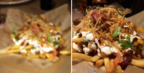
Before and After: FriesClick to Open Overlay Gallery
Martha style (left): Soft focus and a wide angle, representing the vast mysteries of life. Normal style (right): A sharp focus and a tighter crop on the meal, representing Guy Fieri’s Dragon Chili Cheese Fries. Image: Casey Johnston/WIRED
You may even consider photographing your food from side angles. Try cropping in on a portion of your plate or using a macro lens attachment such as the Olloclip. Most professional food photographers use a portrait lens or a longer-zoom macro lens for their shots, which helps them get tight shots without getting food on the lens. Those pro lenses aren’t realistic options for your phone, but a tighter crop or a little macro lens can help you imitate that look.
That’s a lot to get used to. It will change the overall vibe of your shots. You’ll be able to make out the finer details of your dish. The colors may look disappointingly accurate. The lighting will be just so. But the masses will slurp it up. Yes — you’ll have them slurping right out of your hand.
And then, you pounce. They’ll be ready for your more challenging pieces.
Also, have you heard of Instagram? You should totes check it out.
Cordially,
Tim


